
正文
python学习 —— seaborn、matplotlib、pandas、numpy package的混合使用
【扫一扫了解最新限行尾号】
复制小程序
这里使用了Titanic Machine learning数据集,然后通过Seaborn的函数来拟合和绘制回归线,matplotlib进行可视化。
先来一个简单的测试:
import pandas as pd
from matplotlib import pyplot as plt
import seaborn as snsdf = pd.read_csv('../test.csv', index_col=0) # 读取csv表格, index_col=0表示第0列为id
print(df.head(n=5)) # 打印前5行的数据# sns.lmplot(x='Age', y='Fare', data=df)
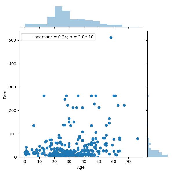
sns.jointplot(x='Age', y='Fare', data=df)# 去掉以下两句代码可发现原点不在最左下角
plt.ylim(0, None)
plt.xlim(0, None)
plt.show() # 可视化
运行结果:

sns.lmplot(x='Age', y='Fare', data=df):

使用sns.jointplot(x='Age', y='Fare', data=df) # 默认为条形图:
sns.jointplot(x='Age', y='Fare', data=df, kind='kde',) # 上右两边的就变为了条形:

我发现python3貌似不能用 pd + plt 实现堆积柱状图:
import pandas as pd
from matplotlib import pyplot as pltdf = pd.read_csv('../train.csv', index_col=0) # 读取csv表格, index_col=0表示第0列为id
print(df.describe())survived_0 = df.Age[df.Survived == 0].value_counts()
survived_1 = df.Age[df.Survived == 1].value_counts()print(survived_0)
print(survived_1)df = pd.DataFrame({'Death': survived_0, 'Survival': survived_1})
df.plot(kind='bar',) # 条形plt.title('View by Age')
plt.xlabel('Age')
plt.ylabel('Density')plt.show()
运行结果: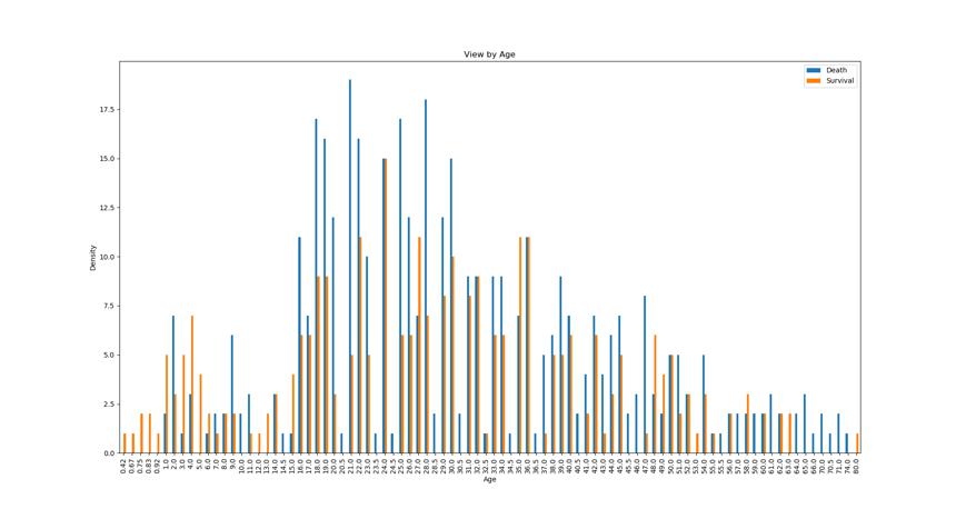
将df.plot(kind='bar')改为
df.plot(kind='kde',) # 曲线
运行结果:

这样也不错:
g = sns.jointplot(x='Survived', y='Fare', data=df, kind='kde',)g.plot_joint(plt.scatter, c="w", s=30, linewidth=1, marker="+")
g.ax_joint.collections[0].set_alpha(0)
运行结果:
sns.load_dataset()是调用官网github网站中的数据集或者安装包时下载到本地的数据集:

不出我意料的有titanic,于是使用之:
sns.set(style="ticks", color_codes=True)
titanic = sns.load_dataset('titanic', cache=False) # 看底层代码,设置cache为False就不用联网去找了
g = sns.pairplot(titanic, hue="age",) # hue不能传入'survivde' 记得都是小写plt.show()
数据较多 运行有点慢、有点卡 = =:

未完待续。。。


视频教程)")


